
👋 Recap from Lesson 1:
We learned that Human Computer Interaction (HCI) is about making the meeting place between humans and computers—called an interface—as smooth, natural, and forgiving as possible.
We met the five magic tools:
- affordances (what actions are possible),
- signifiers (the hints of how to act),
- mapping (control matches result),
- constraints (safe limits), and
- feedback (the system talks back).
We also saw that usability has five big qualities: learnability, efficiency, memorability, errors, and satisfaction.
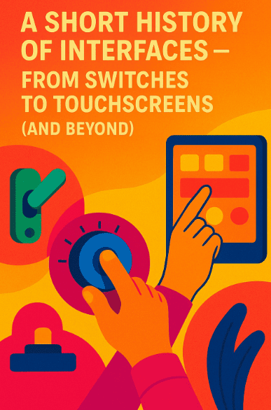
Today we ask: how did we get here? Why do our computers look and feel the way they do today?
1) The very beginning: switches, plugs, and blinking lights 🔌💡
Early computers (1940s–1950s) were giant machines that filled rooms. You didn’t “click” them. You flipped switches, plugged cables, or read blinking lights.
-
Affordance: The switch clearly afforded flipping up or down.
-
Feedback: The machine responded with a tiny light or hum.
-
Constraint: Only trained operators knew which switch to flip.
These computers were so unfriendly that only specialists could use them. Imagine if your fridge required flipping 200 switches to open the door.
That’s where we began.
2) Punch cards and batch processing 🃏💾
Next came punch cards.
A punch card was a stiff paper with holes that represented instructions or data. You would write your program on hundreds of these cards and feed them into a machine. Hours later, you’d get a printout.
-
Affordance: A card affords inserting.
-
Feedback: Sadly, almost none until hours later.
-
Error tolerance: Very low—one wrong hole meant failure.
This era taught us: delayed feedback makes people feel helpless. Modern HCI insists on fast feedback for this reason.
3) The command line era ⌨️📜
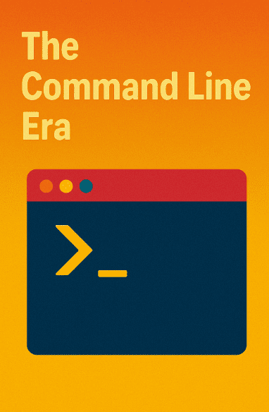
By the 1960s–1970s, people began typing directly into terminals. This was the command line interface (CLI). Instead of flipping switches or feeding cards, you typed commands like:
COPY FILE1.TXT FILE2.TXT
-
Affordance: A blinking cursor afforded typing.
-
Feedback: The system answered with text.
-
Constraint: You had to know the exact words (syntax).
Command lines were powerful but unforgiving. If you forgot a space or mistyped, the system failed.
CLI taught us the danger of recall over recognition [recall = you must remember; recognition = you can spot it when you see it].
4) A giant leap: graphical user interfaces (GUIs) 🖱️🖼️
In the 1980s, companies like Xerox, Apple, and later Microsoft introduced the graphical user interface (GUI). Instead of typing, you could see icons, windows, and menus and use a mouse to point and click. This was called WIMP: Windows, Icons, Menus, and Pointer.
Why it mattered:
-
Recognition instead of recall. You didn’t have to remember “COPY FILE1 FILE2.” You could drag a file from one folder to another.
-
Direct manipulation. You grabbed things on the screen like they were real.
-
Metaphors. Files looked like paper documents. The trash can looked like a bin.
This made computers usable by millions of everyday people, not just experts.
5) The age of the web 🌐🖥️
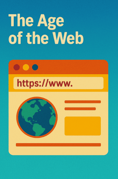
In the 1990s, the World Wide Web arrived. Now you could click links to move between documents across the planet.
-
Affordance: Blue underlined text signified “click me.”
-
Feedback: A page loaded.
-
Constraint: Slow connections tested patience.
The web exploded because it was universal. Anyone with a browser could access the same content, without special training.
But the web also taught us about information overload.
With millions of links, people got lost. This birthed information architecture [the art of organizing content].
6) Mobile and touchscreens 📱👆
In 2007, the iPhone introduced the multi-touch interface. Instead of clicking with a mouse, you used your fingers.
-
Affordance: A button on screen looked tappable.
-
Feedback: Smooth animations and tiny vibrations told you it worked.
-
Mapping: Pinch-to-zoom felt natural (fingers move apart = picture grows).
Touch was revolutionary because it removed the pointer. The human body directly touched the content. Kids could use an iPad before they could read. This is intuition in action.
7) Natural interfaces: voice, gestures, and beyond 🎙️🙌
Now, we speak to assistants like Siri, Alexa, or Google Assistant. We wave our hands to control gaming consoles (like Kinect). We wear VR headsets that track our gaze.
-
Voice affordance: A microphone button invites speaking.
-
Feedback: A voice replies.
-
Constraint: Speech recognition is imperfect; accents and noise matter.
These are called natural user interfaces (NUIs) – they mimic how we interact with the world.
But they also show challenges: humans expect natural language, but computers still stumble. That’s why AI (artificial intelligence) is critical here.
8) Each era solved a problem—and created a new one
-
Switches and cards: solved complexity of machine guts, but excluded normal users.
-
Command lines: faster, but required memorization.
-
GUIs: friendlier, but sometimes too cluttered.
-
Web: global, but overwhelming.
-
Touch: direct, but small screens limit detail.
-
Voice: hands-free, but error-prone.
HCI is a story of trade-offs [choices where fixing one problem introduces another]. The field never ends because humans and contexts keep changing. However, we keep improving the overall.
9) The lesson of history: principles remain, forms evolve
Across all eras, the same core principles keep showing up:
-
People need clear signifiers of what to do.
-
People need immediate feedback.
-
People prefer recognition over recall.
-
People succeed when systems match mental models [your inner picture of how something works].
These truths were as real with switches as they are with touchscreens. The forms change; the principles last.
10) A glance toward tomorrow 🔮
What’s next? Researchers are exploring:
-
Brain-computer interfaces [BCI = direct signals from brain to machine].
-
Augmented reality [AR = digital info over the real world].
-
Wearables [tiny devices on our bodies, always present].
All of these aim to shrink the gap between human intent and computer action.
Whether it’s typing, clicking, touching, or thinking, the dream is the same: computers that “just work.”
11) A tiny story: why Google Search mattered so much
In 1998, Larry Page and Sergey Brin created Google. At that time, other search engines had crowded homepages full of ads and categories. Google’s homepage had just one search box.
This design honored HCI lessons:
-
Focus on the user’s goal (find info fast).
-
Simple default (just type).
-
Fast feedback (results in seconds).
-
Forgiveness (spelling help).
That “one box” changed how billions thought about computers. It felt like magic because it respected human needs.
12) The “why” of this history
Why study this? Because every new technology feels exciting, but most of its success depends on how it fits people’s minds and bodies.
If we forget history, we repeat mistakes.
If we honor history, we design wisely.
13) Mini-project (try at home)
Ask two people from different generations (e.g., a parent and a younger sibling):
-
What was the first computer they used?
-
What was hard about it?
-
What felt easy or natural?
-
How do they feel about today’s devices?
Write down the differences. Notice how context and history shape what feels “intuitive.”
14) Quick recap (seal the knowledge)
-
Interfaces moved from switches → punch cards → command lines → GUIs → web → touch → voice.
-
Each step solved old problems and introduced new ones. However, overall – it did become easier to use.
-
The deepest lessons remain the same: clear signifiers, fast feedback, recognition, and matching mental models.
-
Google’s “one box” design was a turning point because it felt intuitive and forgiving.