
👋 Recap from Lesson 4:
We explored feedback (the system’s way of talking back) and constraints (the safe limits that prevent mistakes).
We saw how feedback reassures, constraints guide, and both together make people feel safe and confident.
We studied examples from elevators, progress bars, and seatbelt reminders.
Now we’ll focus on two more fundamental ideas: mapping (the relationship between control and result) and visibility (how clearly a system shows what is possible and what state it’s in).
These two are critical for making interfaces feel natural.
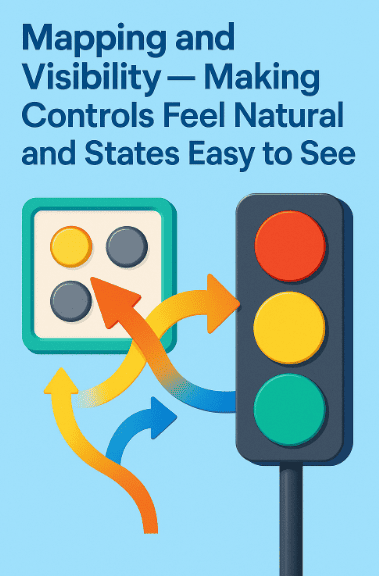
1) What is mapping?
Mapping is the relationship between a control and its effect.
-
A steering wheel: turn left → car goes left.
-
A stove knob: knob front-left → burner front-left.
-
A volume slider: up → louder; down → quieter.
When mapping is natural, you barely need to think. When mapping is unnatural, you pause, hesitate, or make mistakes.
2) Natural mapping vs. arbitrary mapping
-
Natural mapping: The arrangement of controls matches real-world results.
Example: TV remote with volume buttons stacked vertically (up = louder, down = softer). -
Arbitrary mapping: Controls are placed without logic.
Example: Stove knobs in a straight line but burners in a square. Users guess wrong.
Natural mapping uses spatial analogies [spatial = about space and position] to reduce thinking.
3) Poor mapping causes real frustration
Imagine a hotel room with four switches by the door. You press one—nothing obvious. Press another—lamp flickers. Another—fan whirs. Another—wrong light turns on.
This confusion comes from bad mapping. Without labels or natural layout, trial and error replaces intuition.
4) What is visibility?
Visibility means: Can the user see what actions are possible and what the current state is?
-
A “mute” icon that shows crossed-out speaker → visible state.
-
A grayed-out menu option → visible constraint.
-
Highlighted tab → visible location (“you are here”).
When visibility is poor, users feel lost.
5) Why mapping and visibility belong together
Mapping tells which control leads to which result.
Visibility tells what controls and states exist right now.
Together, they let people act with confidence.
Example: A car dashboard.
-
Mapping: Speedometer needle maps to actual speed.
-
Visibility: Lights show turn signals, fuel, and warnings.
6) Case study: Apple’s iPod click wheel 🎵

The iPod had a circular wheel: rotate clockwise to scroll down, counterclockwise to scroll up.
-
Mapping: Circle motion maps to list scrolling.
-
Visibility: A highlighted line showed current selection.
This design felt natural because mapping matched physical movement and visibility kept state clear.
7) Case study: Google Maps navigation 🗺️
-
Mapping: Drag map left → map moves left (natural direct manipulation).
-
Visibility: Blue dot shows where you are. Highlighted route shows where you’re going.
Without the blue dot (visibility), users would be lost. Without natural mapping (drag = move), using the map would feel clunky.
8) Visibility of system status
Jakob Nielsen’s first usability heuristic: “Visibility of system status.”
This means: Always keep users informed of what’s happening.
Examples:
-
Progress bar showing loading.
-
“You are offline” message.
-
Selected tab highlighted.
If the state is hidden, users feel anxious.
9) The emotional effect of good mapping and visibility
-
Good mapping makes people feel in control (“Of course this switch controls that light”).
-
Good visibility makes people feel safe and oriented (“I know where I am and what’s happening”).
-
Poor mapping + poor visibility makes people feel lost and clumsy.
Designers aim to reduce this cognitive strain.
10) How to design good mapping
Tips:
-
Place controls in the same arrangement as results (spatial mapping).
-
Use directional metaphors (up = increase, down = decrease, right = forward).
-
Group related controls together.
Bad mapping forces users to memorize. Good mapping lets them see and guess right.
11) How to design good visibility
Tips:
-
Always show the current state (selected option, active mode, progress).
-
Make active controls stand out; inactive ones look different.
-
Use consistent icons for state (muted = crossed-out speaker everywhere).
Good visibility makes a system self-explanatory.
12) Mini-project (try at home)
Find three everyday objects:
-
A TV remote.
-
A kitchen appliance.
-
A phone app you use daily.
For each:
-
Is the mapping natural? Or do you have to memorize?
-
Is the visibility clear? Do you always know what state it’s in?
-
Sketch or note one improvement that would reduce confusion.
13) Quick recap 🌟
-
Mapping = control → result relationship. Natural mapping matches real-world expectations.
-
Visibility = showing actions and states clearly.
-
Good mapping reduces guessing. Good visibility reduces anxiety.
-
Together, they make systems feel natural and safe.