👋 Recap from Lesson 3:
We explored affordances (what actions are possible) and signifiers (the hints that show where to act). We learned that hidden affordances make actions invisible, while false signifiers make people feel tricked.
Good design balances clear cues with simplicity, making users feel smart and confident.
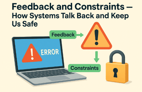
Now we look at two more pillars of HCI: feedback (the system’s way of talking back) and constraints (the safe limits that prevent errors). Without these, systems feel silent and unsafe.
1) What is feedback?
In plain words: feedback is the system telling you what just happened.
-
You click a button → it changes color.
-
You type a wrong password → a red warning appears.
-
You pull a handle → the door unlatches with a “click.”
Feedback closes the loop of action: you act, the system responds, and you know your action worked.
Good feedback is:
-
Immediate [as close to instant as possible].
-
Relevant [shows the result of your action].
-
Clear [easy to understand, not cryptic].
2) The pain of missing feedback
Imagine pressing an elevator button. It stays dark.
You press again. Still nothing. Did the elevator hear you? Did it break?
This is missing feedback. The user feels anxious, so they repeat the action. Sometimes this causes errors (double orders online, double charges on cards).
A simple light-up button would fix it.
3) Types of feedback
Feedback can appear in many modalities [different senses]:
-
Visual: Button changes, progress bar, message on screen.
-
Auditory: Ding sound, spoken word, alarm.
-
Haptic: Phone vibrates, controller rumbles.
-
Environmental: A door physically moves, a light turns on.
Often, designers combine them for clarity. For example, when you send a message: the “whoosh” sound + visual confirmation + vibration reassure you.
4) Good vs. bad feedback
-
Good: A progress bar that fills smoothly and shows time left.
-
Bad: A frozen screen with no signal, leaving you unsure.
-
Good: A clear error message (“Password must be 8 characters, include 1 number”).
-
Bad: “Error: Code 42.”
Good feedback helps users recover. Bad feedback blames or confuses.
5) What is a constraint?
A constraint is a rule or limit that prevents mistakes.
-
A plug that only fits one way.
-
A form that won’t allow February 30.
-
A grayed-out button when a field is incomplete.
Constraints gently guide behavior so users don’t fail.
6) Types of constraints
-
Physical constraints
Example: A USB-C plug only fits one way. A game joystick moves only in certain directions. -
Logical constraints
Example: If you type “@gmail” without “.com,” the system knows it’s incomplete. -
Cultural constraints
Example: A red light means “stop” worldwide. A trash can icon means “delete.” -
Semantic constraints [semantic = meaning-based]
Example: In a puzzle, a large piece can’t fit into a small hole. In a calendar, only valid dates are allowed.
7) Feedback and constraints working together
Think of online payments:
-
Constraint: You can’t proceed without filling required fields.
-
Feedback: Errors highlight missing parts, with tips like “Card number too short.”
Both guide the user toward success safely.
8) Case study: the seatbelt reminder 🚗
Modern cars combine feedback + constraint for safety:
-
Constraint: The car won’t start moving without seatbelts in some models.
-
Feedback: A beeping alarm + dashboard icon remind you.
This combination changes behavior, saving lives.
9) Case study: the progress bar 📊
Why are progress bars important? They manage time perception. Without them, users feel lost.
Even if a task takes 30 seconds, showing “Loading… 50%” makes it feel shorter because you can see progress.
This is called perceived responsiveness [how fast something feels, not just how fast it is].
10) Emotional side of feedback and constraints
-
Positive feedback makes people feel confident (“Yes, I did it!”).
-
Negative feedback can hurt if phrased poorly (“Error! You failed!”). Better: “Oops! Try adding one more number.”
-
Constraints can frustrate if hidden. But if explained clearly, they feel like help, not punishment.
11) Micro-feedback: the smallest signals

Tiny signals matter:
-
A button briefly darkens on tap.
-
A cursor blinks where you type.
-
A checkbox ticks smoothly.
These micro-feedbacks confirm actions instantly, reducing uncertainty.
12) Designing feedback well
Good feedback is:
-
Timely (immediate or clearly staged).
-
Proportional (big signal for big event, small signal for small event).
-
Polite (guide, don’t scold).
-
Reversible (let users undo mistakes).
13) Mini-project (try at home)
Pick one app you use daily. Ask:
-
What feedback does it give for actions? (Visual, sound, vibration?)
-
Are there any missing or unclear feedback moments?
-
What constraints does it use to prevent errors? (Required fields, disabled buttons?)
-
Do they feel helpful or annoying? Why?
-
Sketch or note one way to improve both feedback and constraints.
14) Quick recap 🌟
-
Feedback = the system’s response to your action.
-
Good feedback is immediate, clear, relevant, and polite.
-
Constraints = rules that prevent mistakes.
-
Constraints can be physical, logical, cultural, or semantic.
-
Feedback reassures; constraints guide.
-
Together, they keep systems safe, efficient, and trustworthy.