
👋 Recap from Lesson 2:
We traveled through the history of interfaces.
We saw how humans moved from switches → punch cards → command lines → graphical user interfaces (GUIs) → web → touchscreens → voice and natural systems.
Each step solved old problems but brought new ones.
We learned the key principle: no matter the era, humans need clear signifiers (hints), fast feedback, and designs that match their mental models (their inner picture of how things work).
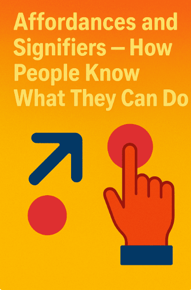
Now, we zoom in on two of the most powerful concepts in HCI: affordances and signifiers.
These two words explain how we know what something can do and how we know where to act.
1) What is an affordance?
The word affordance was first used by psychologist James J. Gibson in 1977. He meant: “what the environment offers to an animal, what it affords the animal to do.”
Put simply: an affordance is what an object allows you to do.
-
A chair affords sitting.
-
A knob affords turning.
-
A button affords pressing.
-
A link affords clicking.
Affordances exist whether or not people notice them. A rock affords throwing. A flat surface affords placing things.
In Human Computer Interactions, we care about perceived affordances—what people think they can do. If the affordance is invisible, it’s useless.
2) What is a signifier?
A signifier is the visible, audible, or tangible hint that tells you where the action is possible.
-
A button’s raised shape is a signifier.
-
An underlined blue link is a signifier.
-
A door handle is a signifier that says “pull here.”
-
A microphone icon is a signifier for voice input.
Designer Don Norman (author of The Design of Everyday Things) emphasized:
“Affordances are about possibilities. Signifiers are about communication.”
Without signifiers, people may miss affordances. A flat touchscreen affords tapping, but unless a button looks tappable, users won’t know it.
3) Affordance without signifier = hidden potential
Imagine a flat glass door with no handle. It affords pushing, but without a visible handle or signifier, people hesitate. They wave their hands, unsure.
This is called a hidden affordance: something you can do, but cannot see how. Computers are full of them:
-
Swiping left to delete an email (unless you try, you won’t know).
-
Pinch-to-zoom (kids discover it naturally, but it has no clear signifier).
Hidden affordances make systems feel mysterious.
4) Signifier without affordance = false promise
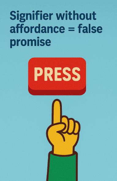
The opposite problem is when a signifier suggests an action, but the affordance is not there. This is called a false affordance or misleading signifier.
-
A button that looks clickable but isn’t.
-
An underlined word in text that’s not a link.
-
A door handle that looks like “pull” but really requires “push.”
False promises create frustration and mistrust.
5) Natural mapping and clear cues
One way to strengthen signifiers is natural mapping: controls match real-world expectations.
-
A stove knob arranged in the same layout as burners.
-
A volume slider that moves up = louder, down = quieter.
-
A scroll bar where dragging down shows content lower on the page.
When mapping matches our mental models, the signifiers feel obvious.
6) Case study: the iPhone’s home button 🔘
The original iPhone had a single round button on the front.
-
Affordance: A round button affords pressing.
-
Signifier: It was recessed with a glossy shine. You knew to press it.
-
Constraint: There was only one button, so no confusion.
-
Feedback: A click sound and screen response confirmed success.
This design became iconic because it merged affordance + signifier perfectly.
7) Case study: the disappearing hamburger menu 🍔
Many apps use a hamburger icon (three horizontal lines) as a signifier for “menu.” At first, users didn’t know what it meant. It was a weak signifier—learnable, but not intuitive.
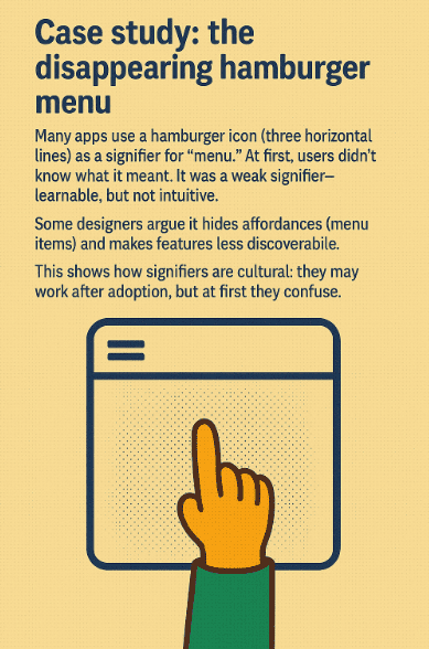
Some designers argue it hides affordances (menu items) and makes features less discoverable. This shows how signifiers are cultural: they may work after adoption, but at first they confuse.
8) Affordances in the physical vs. digital world
In the physical world:
-
Doors, knobs, handles give strong physical affordances.
-
Constraints are built into materials (a chair won’t bend).
In the digital world:
-
Affordances are designed. Nothing “naturally” affords tapping—designers must make it appear so.
-
Signifiers become even more critical. A clickable word must look clickable, or users won’t try.
Thus, digital design = crafting signifiers to make invisible affordances visible.
9) Gestures: invisible affordances in touch systems 👆
Gestures like swipe, pinch, or long press are powerful but invisible.
-
Swipe left to delete: affordance exists, but no signifier.
-
Pinch to zoom: discovered by play, not by cues.
-
Long press for options: hidden until you know.
Designers often add hint animations (e.g., a little hand swiping) to act as signifiers for hidden gestures.
10) Balancing discoverability and simplicity
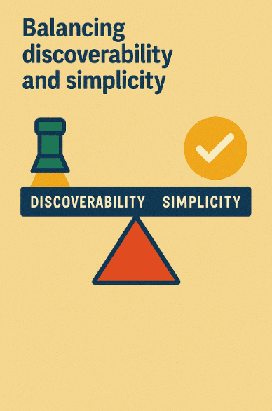
Adding too many signifiers clutters the screen. Too few makes features hidden. Good design balances:
-
Essential actions → strong signifiers.
-
Advanced actions → discoverable gradually.
For example, a camera app may clearly show the “take photo” button, but hide filters in a gesture for advanced users.
11) Mini story: the sticky notes app 📝
A digital sticky notes app shows blank squares on screen.
A user taps one, it opens for writing.
The affordance (tap to edit) is not clear until you try.
If the app added a pencil icon on the note, that would be a signifier.
A small hint can turn confusion into clarity.
12) The emotional effect of signifiers
When signifiers are missing, people feel stupid (“Maybe I don’t get it”). When signifiers are misleading, people feel tricked. When signifiers are clear, people feel smart and confident. This is why Don Norman said:
“Good design makes the user feel smart.”
13) Quick recap 🌟
-
Affordance = what you can do.
-
Signifier = hint that shows you can do it.
-
Hidden affordances confuse; false signifiers frustrate.
-
Good mapping makes signifiers natural.
-
In digital design, affordances don’t exist physically—we must create signifiers.