
👋 Since this is our first lesson, there’s no earlier lesson to recap.
So we’ll start with a tiny warm-up: in this course, we learn how to make computers match human minds and bodies so that using them feels easy, natural, and even joyful.
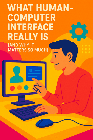
“Human Computer Interaction,” or HCI, is the field that studies exactly this. Today, we will build the base of everything to come.
A friendly promise for this lesson
We will explain every tricky word the moment we use it. We will move in small, clear steps. We will also do fun practice activities (H5Ps) to lock ideas in your brain. Ready? 🌱
1) A gentle picture of HCI
Imagine a light switch on the wall. You push it up, the room becomes bright. You push it down, the room becomes dark. No guidebook needed.
This is because the switch affords pushing [“afford” here means “it invites you to do a certain action”], and the result is obvious.
The light turning on is feedback [the system’s way of talking back to you].
The shape and placement of the switch are signifiers [visual hints that say “touch here”].
Now imagine an old command line on a computer. You must type a secret sentence to make the machine do something.
If you don’t know the sentence, nothing happens. The light switch felt natural; the command line felt mysterious. HCI asks: how can we make our computer systems feel more like that simple, honest light switch?
Human Computer Interaction (HCI) is the study and practice of how people and computers work together.
The word interface means “the meeting place where a person and a computer exchange actions and signals.”
Screens, buttons, voice, gestures, vibration, sounds, even eye movements—these are all modalities [different ways to send and receive information].
HCI has one big goal: help a person reach their goal with comfort, clarity, and safety.
2) The three actors: Human, Computer, and Context
Every interactive moment has at least three parts:
-
The human [the person with a goal, with eyes, hands, thoughts, and feelings].
-
The computer [the system that can sense input, process data, and produce output].
-
The context [the place and situation: noisy bus, quiet office, bright sun, slow internet, small phone, large desktop].
If we change the context, the same design can feel easy or hard. A tiny button might be fine at a desk but terrible on a bumpy bus. So HCI always asks, “Who is the person? What is their goal? Where and how will they use this?”
3) A simple loop for every interaction
When you use a computer, you do a little dance with seven steps, even if you do not notice it. We can say it in plain words (in classic HCI, this is called the seven stages of action):
-
You form a goal [decide what you want].
-
You plan an action [pick how you’ll try to do it].
-
You act [touch, click, speak].
-
The system changes [inside and outside].
-
The system shows a result [feedback on screen, sound, vibration].
-
You see and interpret the result [did anything happen?].
-
You compare the result with your goal [did I succeed?].
If steps 2–3 feel confusing, we have a gulf of execution [a gap between what you want and how to do it].
If steps 5–7 feel confusing, we have a gulf of evaluation [a gap between what happened and what you can understand]. Good HCI shrinks both gulfs so the dance feels smooth. 🕺💻
4) Five qualities that make something “usable”
Designers often measure usability [how easy and effective a thing is to use] with five plain qualities:
-
Learnability [how fast a new user can start].
-
Efficiency [how quickly an experienced user can get things done].
-
Memorability [how easily you can return after a break and still use it].
-
Errors [how many mistakes people make, how serious they are, and how easily they recover].
-
Satisfaction [how pleasant the experience feels].
These are simple words, but they give us honest targets. If we improve them, people feel the difference.
5) Core ingredients: affordances, signifiers, mapping, constraints, feedback
Let’s gently define our five most useful building blocks:
-
Affordance: what actions are possible. A knob affords turning. A slider affords sliding.
-
Signifier: the visible hint that tells you where and how to act. A raised button looks pressable; a link is underlined.
-
Mapping: the relationship between control and effect. When the right stove knob controls the right burner, mapping is natural.
-
Constraint: a safe limit that prevents errors. A date picker that won’t allow February 30 is using a constraint.
-
Feedback: the system talks back right away. A button shows a pressed state; a phone vibrates; progress shows 30%…60%…done.
When these are present and clear, a design feels “intuitive” [easy to guess on first try].
6) The interface is a language
An interface is a type of language. You and the computer exchange short messages. You say, “Open,” with a tap.
The computer answers, “Opened,” with a screen change and maybe a sound. If the language is consistent, you learn it fast. If it changes often, your brain wastes energy.
This is why consistency [same rules in similar places] matters so much.
But we also want forgiveness [the system understands near misses]. If you type “flite” instead of “flight,” a helpful system guesses your intent. Forgiveness makes a system feel kind.
7) What makes an experience “intuitive”?
People often say, “I want the design to be intuitive.” Here is a precise way to think about that word:
An experience feels intuitive when it matches what you already know (your mental model [your inner picture of how something works]), clearly shows what you can do next, responds right away, and forgives small mistakes. To reach that, we use familiar metaphors, gentle hints, and good defaults. We will go deep on that idea in Topic 4 later. For now, hold this short idea: “intuitive = familiar + visible + responsive + forgiving.”
8) A tiny story: why a simple search box felt like magic
Think about a classic search page with one big box. No complex menus.
You type what you want in your own words.
As you type, you see helpful suggestions. You press enter. You get results, with your words bolded.
If you made a spelling mistake, the system offers, “Did you mean…?” This feels natural because it uses plain language [words we speak daily], good defaults [just type and go], fast feedback [results quickly], and error tolerance [spelling help].
The system carries the hard work; the human keeps a light mind.
9) The HCI process in one breath
HCI is not only ideas; it is a process [a set of steps we repeat]:
-
Research [learn about people, their goals, their context].
-
Define the problem in clear words.
-
Prototype [make a simple, quick version to try ideas].
-
Test with real people and observe.
-
Iterate [improve, then test again].
-
Measure with honest numbers (like time, errors, and success rate).
-
Release and monitor in the real world.
We will learn each of these with care, but today you just need to know that HCI is both a science (we observe and measure) and a craft (we shape and refine).
10) Safety, kindness, and access for all
A design can be fast and pretty but still be unfair or unsafe. So HCI adds three big promises:
-
Accessibility [people with different abilities—vision, hearing, movement, thinking—can use it fully].
-
Privacy [we collect as little personal data as needed and protect it].
-
Ethical design [we do not trick; we nudge gently toward the user’s own goals, not ours].
When we honor these, trust grows. Trust is the quiet engine behind long-term success.
11) Measuring reality without tricks
How do we know a design improved?
We measure task success [did people finish what they came to do], time on task [how long it took], errors [how many and how severe], and satisfaction [how it felt].
There are also quick, standard surveys like SUS [System Usability Scale; a short questionnaire] and UMUX [Usability Metric for User Experience].
Do not worry about the names now; just know we will use small, honest numbers to check if our design really got better.
12) The smallest possible HCI lab: your own eyes, ears, and notebook
You can begin today.
Watch someone try to do a task on a website or app. Ask them to think aloud [say what they are trying to do and why].
Do not help. Just listen and note where they pause or frown.
Each pause is a clue.
Each frown is a clue.
Later, make a tiny prototype that removes one pause. Test again. You are now doing HCI.
13) When designs go wrong (and how HCI fixes them)
Have you ever pressed a “Submit” button and nothing seemed to happen? You press again, and now you get two charges on your card. Ouch. What failed?
The feedback was missing or late, so you did not know the first click worked. The mapping from your click to the system’s response was invisible. How to fix?
We show a pressed state on the button right away.
We disable it for a moment and show a gentle spinner with the words, “Processing… this may take up to 5 seconds.”
If the network fails, we show a clear error message [a short sentence that explains what went wrong and how to fix it] and offer undo or retry.
The human stays calm. The system feels trustworthy.
Another example: a form that asks for a phone number but gives no hint of the right format.
People type different styles. The system rejects them and wipes the whole form.
Terrible.
The fix is simple: show the expected format, accept common styles, and never wipe other fields.
This is called error prevention [avoid mistakes], forgiveness, and graceful recovery [easy path back from errors].
14) The map of the course from here
This lesson gave you the base language: what HCI is, what “interface” means, how the human–computer dance works, and which building blocks shine in good design.
15) Mini-project (optional but fun)
Pick a small, annoying task you do on your phone. Maybe it is turning off an alarm, paying a bill, or finding a photo. In a notebook, answer:
-
What is your goal?
-
What actions do you try?
-
Where do you feel a gulf of execution (you’re not sure how to act)?
-
Where do you feel a gulf of evaluation (you’re not sure what happened)?
-
Sketch a tiny prototype [a rough drawing] that uses clearer signifiers and quicker feedback.
-
Test your sketch with a friend. Ask them to think aloud while “using” it. Note their pauses. Improve one thing.
This tiny loop is real HCI work. 🎯